Easy Statistics for Model Evaluation

Statistics is the tried and true way of evaluating the performance of a machine learning model. I wrote the material below about two years ago when I was in the thick of my PhD. It's a basic overview of many terms you'll hear over and over again in your Machine Learning 101 at school and work. If you're just getting started or need a refresher, I hope this primer will serve you well. There are links embedded throughout and footnotes at the bottom of this blog post.
Scenario 1 - Energy Bar Classifier
Let’s suppose we’re building an image classifier for a specialized grocery store so that customers can identify different types of healthy food products.

To build our classifier we’ll use a convolutional neural network (CNN) pretrained on a dataset such as ImageNet. We can apply transfer learning and use the base network of the CNN (e.g. ResNet50) as a feature extractor for our new, limited dataset of images we want to predict on. We split our data into a training, validation, and test set. The representations of features from the base network contain all the mappings of features across 1000 different objects, and as a result, we can achieve accuracy in the high nineties to classify our pictures of different grocery items.
Most of the time, our business is only interested in how well the algorithm performs from a prediction standpoint:
- Is it accurate?
- How many times did it make the right prediction?
- How often does it miss the mark and predict my energy bar as a candy bar?
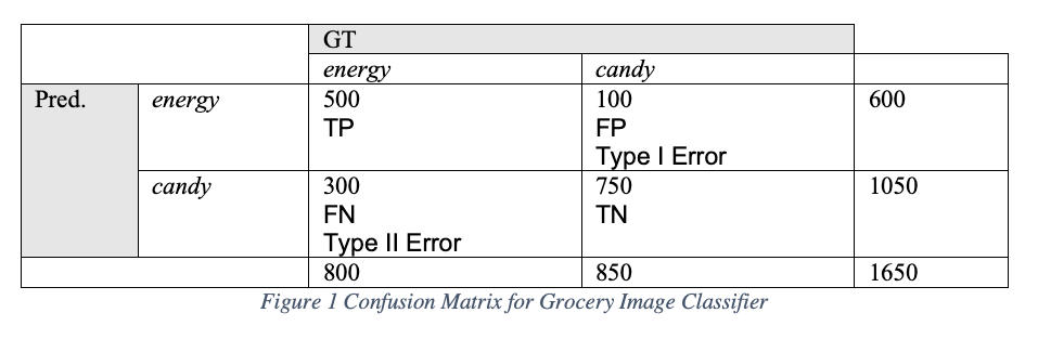
These are basic measurements intended to evaluate the degree of closeness of a prediction to ground truth and reproducibility. Let’s first see how well our image classifier performed on the validation set of 1650 images using a standard contingency table, also sometimes referred to as a confusion matrix.
Interpreting Results
Our interpretation of the results tells us that the model has predicted energy bars correctly (TP) 500 out of 800 possible energy-bar images (0.625 sensitivity)[1].
Sensitivity is also sometimes called “hit rate”, “true positive rate” (TPR), or “recall”. Next we see that energy bars are falsely predicted as candy 100 times out of 850 possibly candy-bar-labeled images. We call these false positives (FP) that tell us how many times the model believes a condition exists or an event occurred, when the truth is, it hasn’t. It’s akin to a false alarm and some have called it “crying wolf” [2]. From this FP’s, also known in medical diagnosis as a “Type I Error”, we can calculate both the false positive rate (FPR) of 0.118 [1] as well as the specificity which is 0.882 [2].
Specificity is sometimes called “true negative rate” (TNR). It helps to know that the higher the specificity, the lower the number of FPs. If we only had one FP in our candy bar example, the specificity would be 0.998 [3]. In addition to specificity we can calculate our “miss rate” also called “false negative rate” (FNR) which is 0.375 [4]. This tells us about how well our model is handling False Negatives (FN) where FN’s tell us that the model believes a condition or event has not occurred, when actually it has. When we calculate accuracy of the model, we want to know how well the predictions agree with the ground truth. Accuracy measures the true predictions out of all the images in the test set and is equal to 0.757 [5]. When we calculate precision, also called “positive predictive value” for our model we find it is 0.833 [6].
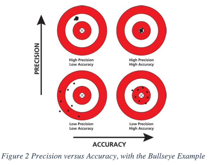
Precision is not the same as accuracy. Let’s consider the classic bull’s eye example above. Precision is about repeatability and measures how consistently (how similar) the predictions will be each time the model is run. Accuracy is when an archer can hit the bull’s eye, but precision is when the archer can consistently hit that bull’s eye over and over again.
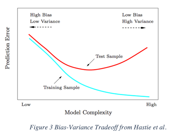
Accuracy and precision tell us about a classic struggle in machine learning – the bias-variance tradeoff. Bias reflects the amount of inaccuracy whereas variance is the amount of imprecision. At the cost of bias, we can decrease variance. Or at the cost of variance, we can decrease bias. What we are looking for when we train any machine learning algorithm, is a sweet spot where both the bias and variance are balanced.
As the model increases in complexity, the variance will increase – or another way of thinking about this is that the amount of imprecision will increase. Shallow networks with only one large hidden layer, such as a simple feedforward neural network, can approximate any to any level of accuracy function based on the universal approximation theorem [9].
But more complex neural networks like a CNN compose multiple functions across layers, increasing the variance. Recall our decision about precision, the ability for the model to predict similar outcomes over and over again will decline. But the bias, or the inaccuracy will decrease, leading to a more accurate model with lower test error.
But with overfitting, the model will learn the distribution of the training data very well leading to a reduced training error (aqua) but high variance. In the end, overfit models fail to generalization on unseen data (high red test error). The model will begin to follow some individual points in the data too closely in an attempt to adopt to complicated underlying patterns. On the other hand, if the data is fit to a model that is not complex enough, it will have low variance and can predict with high precision but will have high error and low accuracy.
Assessing Different Models
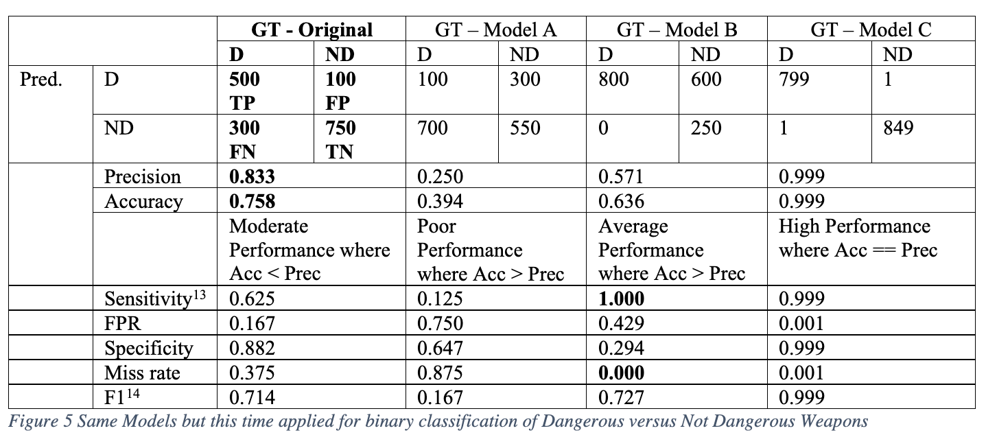
Using the same set of validation data with exactly 800 energy-bar-labeled images and 850 candy-bar-labeled images, we can see how the precision and accuracy changes based on different models that output different predictions.
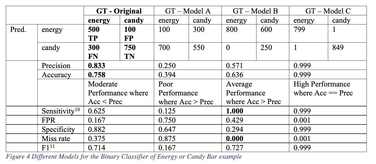
Sometimes we can speculate what’s happening with the model based on these statistics. With Model B, we see that the model has zero FNs and a perfect 1.0 sensitivity (recall = TP / (TP + FN)). This means it never has any misses on candy. It predicts energy bars correctly as energy bars all the time. But it gets confused with candy bars. Perhaps this means that energy bars have very distinctive features, like a big bear standing on a red mountain with a blue sky. But the candy bars might have a logo or color that looks very similar to the energy wrapper, perhaps a red triangle, making the candy features confusing.
In this example, if we only looked at the accuracy of 0.636, we might be tempted to just keep pushing on, add more data, or modify our network and increase complexity. But if we examine the miss rate, we’ll be able to see that there is some strange behavior that wouldn’t be caught if we only paid attention to the accuracy and precision. If red triangle logos are characteristic of all the candy image data we can gather and all energy bars have red mountains confusing the model, it is highly likely that regardless of how complex we design the model, we will not be able to increase our sensitivity, specificity or decrease our FPR, since all three metrics depend on the number of FPs (600). Perhaps one solution would be to add augmentation to distort the images and add variability into the distribution of energy bar images, or get new data.
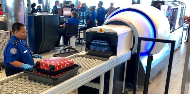
Scenario 2 - Airport Scanner
Let’s consider another example that has higher stakes when it comes to making the wrong predictions. We use a similar image classification model as our grocery store scenario but this time train it to detect high threat and low threat items. For simplicity, we’ll say this is a binary classification problem where we want to predict if the object going through the scanner is dangerous. Non-threatening items could be a pair of sunglasses, whereas a dangerous could be a knife. If we obtained the same results as our energy versus candy bar example, would the statistics mean something different this time? Is there one model that stands out as being the best one?
In this case, airport security doesn’t want to miss any dangerous objects. A high miss rate increases the risk of a dangerous weapon boarding a plane. Here Model B has a zero miss rate which is ideal – the number of predictions that the object is not dangerous (ND) when it actually is (D)angerous is zero. This is a sieve that prevents any dangerous weapons from getting through security. However, Model B has low specificity of 0.294 because of an FPR of nearly 43%, which makes it annoying for the security guards – the model thinks many objects are dangerous when they really are not.
For the original model with a 0.625 sensitivity and Model A with a 0.125 sensitivity, we can say that these models are not robust enough and demonstrate too many misses. Other scenarios where we can’t afford misses include most medical diagnostics such as cancer screening and Covid-19 testing. Scenarios where we care more about a low false positive rate include facial recognition systems that are controversial in their proven discriminatory predictions [12].
Interpreting Curves
Receiver Operating Characteristic (ROC) Curve
Recall the confusion matrix we introduced in the grocery classifier. This confusion matrix tells us about the number of true positives, true negatives, false positives, and false negatives, as we already saw. Confusion matrices are not “static” meaning that the typical matrices we see are calculated with a “threshold” of 0.5.
Any values over 0.5 are considered as being positive (e.g. an energy bar) and any values under 0.5 are considered as being negative (e.g. not being an energy bar). But what if you’re in a circumstance like the airport screening tool where you can’t miss any false negatives at all? We can’t allow any dangerous weapons to get through. Or if you’re overseeing a Covid19 testing algorithm, where you need to ensure no one with Covid19 is missed? In these cases, a threshold of 0.5 may not be right. We may end up letting a lot of false negatives in.
Instead of trying to construct a confusion matrix for every possible threshold, one for 0.5, one for 0.30, one for 0.30, one for 0.10, and so on, the best diagnostic instead is a Receiver Operating Characteristic (ROC). This plot allows you to see the recall (aka sensitivity) and false positive rate, all at once for multiple thresholds. The ROC curve plots the TPR (aka Sensitivity or Recall) on the y-axis and FPR [15] on the x-axis. It’s used to find an optimal classification threshold for a binary classifier that will improve the TPR while minimizing the FPR. ROC curves visualize all classification thresholds. To understand how a ROC curve is constructed let’s consider a binary classifier that uses logistic regression to predict diabetes.
In the below figure, on the x-axis we have the plasma glucose concentration, which as it increases, it follows a sigmoid distribution, increasing the probability of being diabetic.
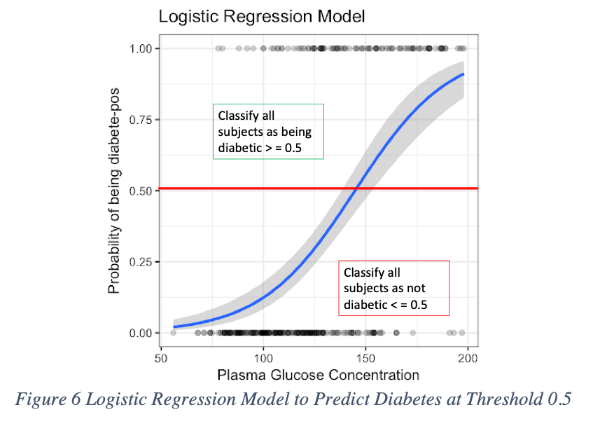
In most cases, binary classifiers are “defaulted” to predict with a 0.50 classification threshold. In this example, the model classifies anyone above 0.50 as being diabetes positive (D+). Anyone below 0.5 is classified as diabetes negative (D-).
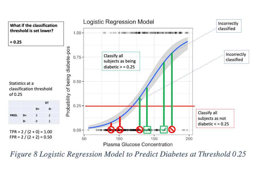
But what if we set the bar lower?
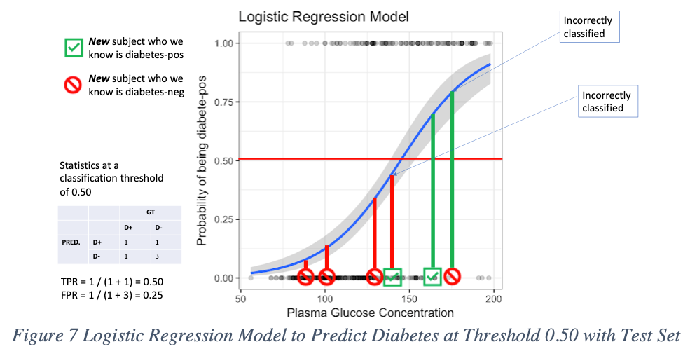
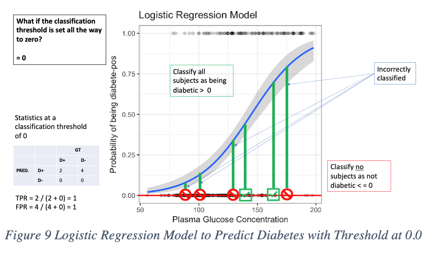
Let’s say to a classification threshold of 0.25. This makes it easier for the model to predict new patients who are D+ as being diabetes positive than before. That’s because we widened the range for what data points are acceptable as positive. Instead of 0.5 to 1, now it’s 0.25 to 1. But now we see more false positives, which is a consequence of lowering the bar. When the classification threshold is lowered, the number of false positives increases. But, on the other hand, we get an advantage in lowering the number of false negatives and true negatives. We can see this when we lower the bar all the way to zero. Now, every data point is classified as diabetic. No one is not diabetic. Consider setting the threshold at 0.0. In the figure below, the model predicts no D-, and everyone is predicted as D+. But we see now that four people who do not have diabetes, are incorrectly being classified as diabetic.
If we increase the threshold all the way to 1.0, the opposite effect happens. We now have a tradeoff where everyone is classified as not diabetic, and no one is predicted to have diabetes. Here the model has no false positives, but at the same time no D+ predictions at all, which is wrong since two people we know have diabetes but the model predicts them as D-.
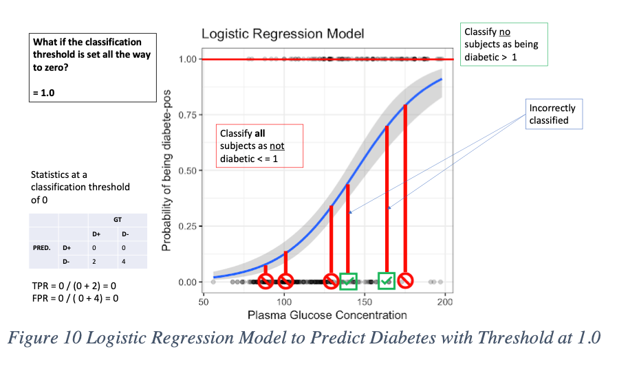
Now that we’ve gone through four examples where we changed the classification threshold, we can plot these on a ROC graph. The way we did this was by plotting the coordinates of (TPR, FPR) on the x and y axis. You’ll see in the figures above, that for each threshold of 0.0, 0.25, 0.50, and 1.0, we calculated the TPR and FPR along the way. You can see that with these brief examples, the ROC curves summarize the four confusion matrices for each threshold into a single plot.
So, what does all this really mean? If someone presents you a ROC plot, you could ask them questions about how they arrived at their threshold classification, instead of using the default out of the box 0.50. Consider that if the problem required the team to maximize the model’s TPR (increasing your recall), then you might glance at the ROC curve and select the threshold at 0.25. But know that this will lead to an FPR of 0.5 where for every false positive you will get one true negative. [16] For our diabetes example, your TPR would be 100%, meaning no false negatives. [17] There are no misses. But you will wind up one person classified as D+ when they’re really not, for each true negative prediction you receive. If this type of scenario is alright with you, where you cannot afford any misses, then the threshold of 0.25 might be right for you.
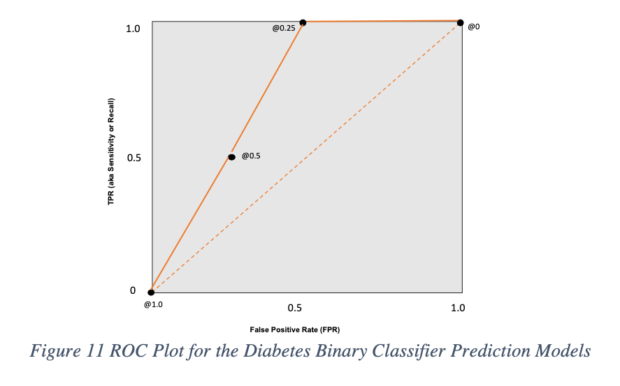
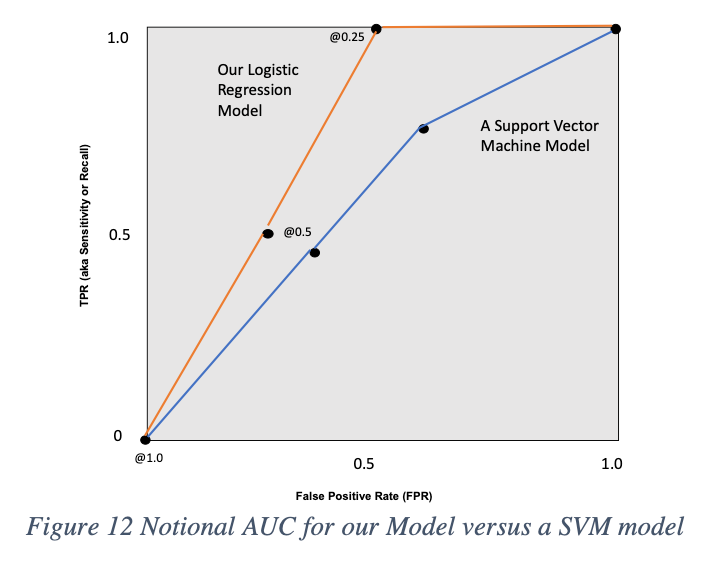
We can also use the ROC curve to measure the Area Under the Curve (AUC) that helps us evaluate which different models. In this case, our logistic regression model’s TPR and FPR metrics can be plotted on the ROC, compared to another model such as a Support Vector Machine (SVM) that we may have tried. Remember that in this case, the SVM was also plotted in the same with all of the TPR’s and FPR’s for various classification thresholds. The AUC is calculated using integration and can be approximated via numerical analysis by using the trapezoid rule that approximates the definite integral. [18]
Conclusion
This blog post provided a detailed dive into very basic statistics that describe model performance. What I appreciate from such basic formulas like sensitivity, is the amount of information they convey when combined in concert with other statistics. As the pace of AI grows, there are increasingly more ways to measure model performance. However, you might be surprised to learn that even in advanced research papers on topics like video generation from diffusion models, these basic statistics still have bearing. For the newcomer to machine learning (and AI), I'd encourage you to delve deeper and also explore some practical libraries like scikit-learn which I absolutely love to learn more. Mastering or at least familiarizing yourself with these metrics will never lead you astray! On my next post, I'll get back to the basics of a high level overview of how algorithms learn.
[1] Sensitivity, Recall or TPR = TP / (TP + FN) = 500 / (500 + 300) = 500 / 800 = 0.625
[2] https://pubmed.ncbi.nlm.nih.gov/8205831/
[3] FPR = FP / (FP + TN) = 100 / (100 + 750) = 100 / 850 = 0.118
[4] Specificity or TNR = TN / (TN + FP) = 750 / (750 + 100) = 750 / 850 = 0.882
[5] In this example, TN = 849, FP = 1, so 849 / (849 + 1) = 0.998
[6] Miss Rate or False Negative Rate = FN / (FN + TP) = 300 / (300 + 500) = 300 / 800 = 0.375
[7] Accuracy = (TP + TN) / (TP + TN + FP + FN) = (500 + 750) / 1650 = 0.757
[8] Precision = TP / (TP + FP) = 500 / (500 + 100) = 500 / 600 = 0.833
[9] Hornik, Kurt, Maxwell Stinchcombe, and Halbert White. "Multilayer feedforward networks are universal approximators." Neural networks 2.5 (1989): 359-366.
[10] Aka Recall
[11] Harmonic mean between precision and sensitivity (aka recall) = 2TP / (2TP + FP + FN)
[12] Lohr, Steve. "Facial recognition is accurate, if you’re a white guy." New York Times 9 (2018).
[13] Aka Recall
[14] Harmonic mean between precision and sensitivity (aka recall) = 2TP / (2TP + FP + FN)
[15] FPR = FP / (FP + TN)
[16] FPR = FP / (FP + TN); so 0.5 means = 1 / (1 + 1) = 1 / 2
[17] TPR (aka recall, sensitivity) = TP / (TP + FN) = 1 / (1 + 0)
[18] See "Trapezoid Rule"