Using brokenaxes to plot discontinuous time


I've been plotting the results of some Covid19 Twitter data analysis, but it's on discontinuous corpora of time. I was making so many plots to capture distinct chunks of time that my paper was getting more and more difficult to read! My advisor suggested I check out a really handy repo called brokenaxes. Find it here: https://github.com/bendichter/brokenaxes
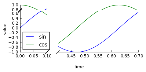
Basically brokenaxes allows you to plot in a single time series, multiple discrete chunks of data in different time ranges, but indicate it simply with two forward slashes like so:
Someone wrote an issue that mentioned how pandas out of the box, is not compatible with brokenaxes: https://github.com/bendichter/brokenaxes/issues/40. True, brokenaxes does not automatically handle plotting with a pandas dataframe, but with some numpy massaging you can get it to work cleanly. With the speed of working directly with arrays, many of you may enjoy how functional brokenaxes can be.
Dataframe to transposed array
So in this example, I have a dataframe of tweets which I resampled using pandas every 1 minute:
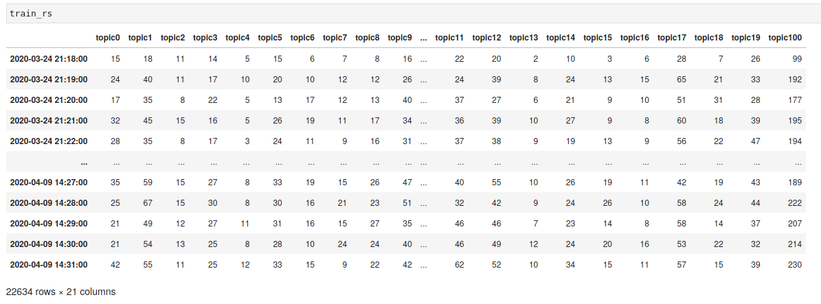
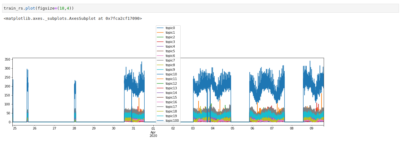
If I were to plot this, what will happen is that all missing dates will be accounted for. So although I have approximately 8400 minutes, it will actually plot over 22,600 minutes:
Representing discrete time chunks of data is the perfect use case for brokenaxes. Here's a basic recipe:
Step 1 - Collect distinct chunks of time from the original dataframe
Below, I'm showing how to slice the dataframe into discrete chunks of time, for the first three corpora, essentially by creating a start/end time mask.
train_mar24 = train_rs.ix[train_rs.index[(train_rs.index > '2020-03-24 21:17:27') & (train_rs.index < '2020-03-24 22:00:48')]]

train_mar25 = train_rs.ix[train_rs.index[(train_rs.index > '2020-03-25 14:45:12+00:00') & (train_rs.index < '2020-03-25 16:18:47+00:00')]]

train_mar28 = train_rs.ix[train_rs.index[(train_rs.index > '2020-03-28 00:17:20+00:00') & (train_rs.index < '2020-03-28 02:01:08+00:00')]]
Step 2 - Transpose each time chunk dataframe
You see I've created a slice called x24 and from it the shape implies 21 (topics) and 43 (minutes).
print(len(train_mar24))

>> 43

x24 = (train_mar24.values).transpose()

print(x24.shape)

>>(21, 43)

print(x24[:5])

>> [[11 11  8 15  8 10 12 10  9  9  7  9 15 16  8 10 12 12 14  8 19  6 17  9 7 14  8  8 19 15  9 11 12  9  9  8 20  9  6 11  8 17 21]
[15 24 17 32 28 24 27 28 19 23 27 20 30 33 30 20 41 24 28 27 30 30 25 27 25 21 26 27 36 21 20 26 25 31 30 26 27 35 33 35 22 23 28]
[18 40 35 45 35 32 36 38 38 39 43 40 42 32 48 23 35 43 39 30 48 41 37 47 38 43 39 49 30 37 42 42 33 41 42 41 35 43 26 48 29 39 34]
[14 17 22 16 17 23 20 14 25 21 25 20 13 19 23 15 15 17 15 13 20 24 21  9 12 14 15 20 17 23 29 18 16 19 12 27 20 23 17 23 21 15 15]
[ 5 10  5  5  3  5  4 10  9  9  5  5  8  3  5  3  3  6 11  9  7  7  2  2 7  6  7  8  5  7  7  8  3  7  1  8 10  8  7  9  7  7  5]]
You can continue this for the rest of the discrete chunks of time/corpora in your data:
x25 = (train_mar25.values).transpose()

x28 = (train_mar28.values).transpose()
Step 3 - Concatenate arrays into a larger list of lists
We can then make a list of lists. Each array in the list is a column vector of dimension (8456, ) where 8456 is the total number of minutes for the entire dataset.
def make_series():
    series =[]
    for i in range(0, 21):
        t = np.concatenate((x24[i], x25[i], x28[i], x30[i], x31[i],
        x4[i], x5[i], x8[i]), axis=None)
        series.append(t)

    return series


list_of_series = make_series()
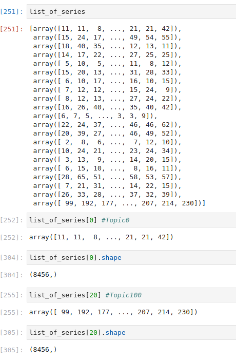
Below is a screenshot of the entire list of lists list_of_series , showing all the time chunks I've been using. The first three I showed you above for March 24, 25, 28th are the first three arrays: [array([11, 11, 8, ..., 21, 21, 42]), array([15, 24, 17, ..., 49, 54, 55]), array([18, 40, 35, ..., 12, 13, 11])
Step 4 - Back of the envelope calculations
Now that we have our "uber" list storing all our arrays, we have to do some basic calculations to figure out the original number of minutes per time chunk. All we need to do is use shape to figure it out:
x24.shape

>>(21, 43)

x25.shape
>>(21, 93)

x28.shape
>>(21, 104)
Now we know where the minutes start and stop for each chunk of time.
Step 5 - Plotting!
Yes, finally! I'm going to show you the plots only for March 24, 25, and 28th to make things simpler. First, we create our segments along the x-axis using our calculations from above. We have: (0, 43) for March 24, (43, 93) for March 25, and (93, 104) for March 28th. If we wanted to keep plotting, all the way out to the 8,456th minute as I've done in my paper, we can keep adding in this "start, stop" formats. But for now, I'm only plotting these three dates.
bax = brokenaxes(xlims=((0, 43), #mar24
                        (43, 93), #mar25
                       (93, 104), #mar28
                       ), hspace=.12)
Next, we have to add our data. Here are the first 5 topics per minute. What's happening in the list of lists we concocted is that each tweet has an assigned topic. So the x0 array is listing out the topic per minute. We need all 20 topics so don't get confused. The array holds ALL the data of the topics for ALL 8456 minutes. Each array in the list represented a topic from 1 to (technically) 21 (but we're leaving out 21 for other reasons). If you only wanted to plot the first two topics for Mar 24, 25, 28, we would just plot x0 and x1 and drop the rest.
x0 = mvgavg(list_of_series[0], 10, axis=0) #Topic 1
x1 = mvgavg(list_of_series[1], 10, axis=0) #Topic 2
x2 = mvgavg(list_of_series[2], 10, axis=0) #Topic 3
x3 = mvgavg(list_of_series[3], 10, axis=0) #Topic 4
x4 = mvgavg(list_of_series[4], 10, axis=0) #Topic 5
Sidebar:
You might be asking, what is this mvgavg? Well, this is a I found a neat library called mvgavghere: https://pypi.org/project/mvgavg/.
Numpy does not include a built-in moving average function as of yet. Most solutions are tedious and complicated and not one liners. This operates similar to the Wolfram Language's MovingAverage[] function, but has the advantage that it can specify axis for higher ndim arrays.
Example usage:
mvgavg(array, n, axis=0, weights = [list of weights])

mvgavg(array, n, axis=0, binning = bool)
Documentation: https://github.com/NGeorgescu/python-moving-average/blob/master/mvgavg/mvgavg.py
Back to business...
To actually plot, call the bax.plot (or whatever you choose to call your brokenaxes). Here we can label and for visibility, I added some hash-mark-styling.
bax.plot(x0, label='topic1')
bax.plot(x1, '--', label='topic2')
bax.plot(x2, label='topic3')
bax.plot(x3, label='topic4')
bax.plot(x4, label='topic5')
bax.plot(x5, label='topic6')
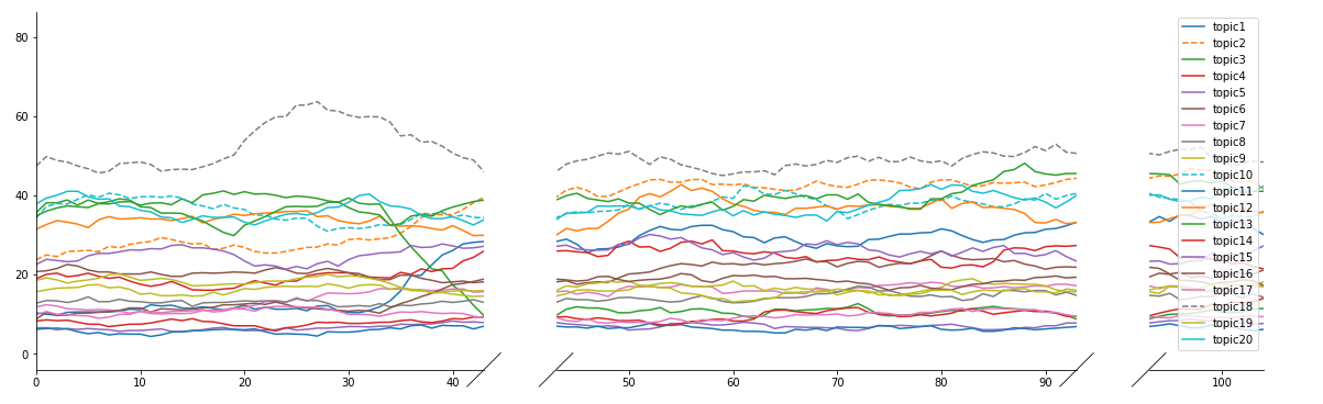
The final code looks like this:
import matplotlib.pyplot as plt
from brokenaxes import brokenaxes
import numpy as np

fig = plt.figure(figsize=(20,6))

bax = brokenaxes(xlims=((0, 43), #mar24
                        (43, 93), #mar25
                       (93, 104), #mar28
                       ), hspace=.12)

x0 = mvgavg(list_of_series[0], 10, axis=0) #Topic 1
x1 = mvgavg(list_of_series[1], 10, axis=0) #Topic 2
x2 = mvgavg(list_of_series[2], 10, axis=0) #Topic 3
x3 = mvgavg(list_of_series[3], 10, axis=0) #Topic 4
x4 = mvgavg(list_of_series[4], 10, axis=0) #Topic 5
x5 = mvgavg(list_of_series[5], 10, axis=0) #Topic 6
x6 = mvgavg(list_of_series[6], 10, axis=0) #Topic 7
x7 = mvgavg(list_of_series[7], 10, axis=0) #Topic 8
x8 = mvgavg(list_of_series[8], 10, axis=0) #Topic 9
x9 = mvgavg(list_of_series[9], 10, axis=0) #Topic 10
x10 = mvgavg(list_of_series[10], 10, axis=0) #Topic 11
x11 = mvgavg(list_of_series[11], 10, axis=0) #Topic 12
x12 = mvgavg(list_of_series[12], 10, axis=0) #Topic 13
x13 = mvgavg(list_of_series[13], 10, axis=0) #Topic 14
x14 = mvgavg(list_of_series[14], 10, axis=0) #Topic 15
x15 = mvgavg(list_of_series[15], 10, axis=0) #Topic 16
x16 = mvgavg(list_of_series[16], 10, axis=0) #Topic 17
x17 = mvgavg(list_of_series[17], 10, axis=0) #Topic 18
x18 = mvgavg(list_of_series[18], 10, axis=0) #Topic 19
x19 = mvgavg(list_of_series[19], 10, axis=0) #Topic 20

bax.plot(x0, label='topic1')
bax.plot(x1, '--', label='topic2')
bax.plot(x2, label='topic3')
bax.plot(x3, label='topic4')
bax.plot(x4, label='topic5')
bax.plot(x5, label='topic6')
bax.plot(x6, label='topic7')
bax.plot(x7, label='topic8')
bax.plot(x8, label='topic9')
bax.plot(x9, '--', label='topic10')
bax.plot(x10, label='topic11')
bax.plot(x11, label='topic12')
bax.plot(x12, label='topic13')
bax.plot(x13, label='topic14')
bax.plot(x14, label='topic15')
bax.plot(x15, label='topic16')
bax.plot(x16, label='topic17')
bax.plot(x17, '--', label='topic18')
bax.plot(x18, label='topic19')
bax.plot(x19, label='topic20')


bax.legend(loc=1)
And the final plot looks like this: