Murder Accountability Project - Part 2 Looking at Weapons and Relationships

Part 2 - Weapon Trends
At this point we can start looking at some of the weapon trends.
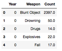
crime_time = pd.pivot_table(data2,index=["Year", "Weapon"],values=["Record ID"],aggfunc=[len])
crime_time.reset_index(inplace=True)
crime_time.columns.droplevel()
crime_time.columns = ['Year', 'Weapon', 'Count']
crime_time.dtypes
crime_time['Year'] = pd.factorize(crime_time['Year'])[0]
crime_time.head()
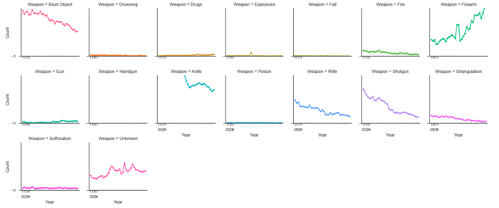
Use a seaborn factor Plot to show use of weapons over time.
# Create a dataset with many short random walks
rs = np.random.RandomState(4)
pos = rs.randint(-1, 2, (20, 5)).cumsum(axis=1)
pos -= pos[:, 0, np.newaxis]
step = np.tile(range(5), 20)
walk = np.repeat(range(20), 5)

sns.set(style="ticks")
# Initialize a grid of plots with an Axes for each walk
grid = sns.FacetGrid(crime_time, col="Weapon", hue="Weapon", col_wrap=7, size=2.5)

# Draw a horizontal line to show the starting point
grid.map(plt.axhline, y=.5, ls=":", c=".5")

# Draw a line plot to show the trajectory of each random walk
grid.map(plt.plot, "Year", "Count", marker="o", ms=4)

# Adjust the tick positions and labels
#xlim is the years factorized from 0 to 34
grid.set(xticks=np.arange(5), yticks=[-1, 1],
     xlim=(-1, 35), ylim=(0, 2500))

# Adjust the arrangement of the plots
grid.fig.tight_layout(w_pad=1.15)
Use of firearms as a weapon has steadily increased form 1980 to 2014, and notice how 'Gun' has also increased, which should really be rolled up into 'Firearm'. Weapons like 'Rifle' and 'Shotgun' should also be folded under 'Firearm' possibly. But, we can see that the number of crimes committed using 'Knife' and 'Blunt Object' are high in count. The 'Unknown' weapon type has also increased over the years.
Understanding victim demographics through relationships and weapons
Let's plot the Number of Cases and Average Ages of Perpetrator and Victims by Weapon and Relationship.
#Get a dataframe where the relationships are known, remove unknowns
known_relationships = data2.loc[(data2['Relationship'] != 'Unknown')]
len(data2) #638454
len(known_relationships) #365441
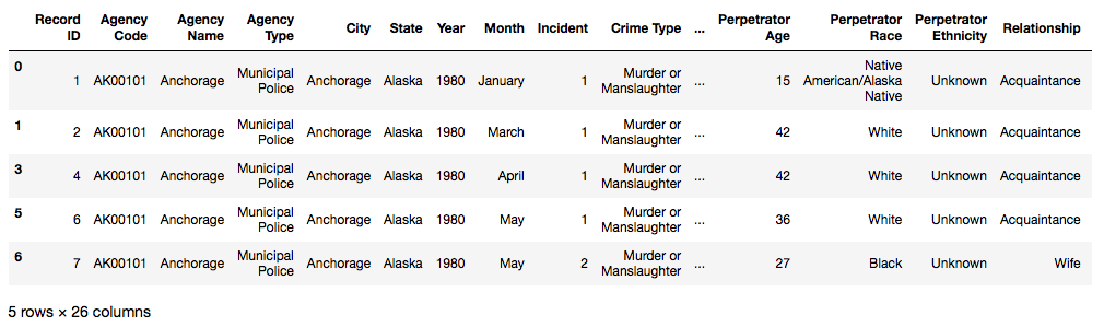
known_relationships.head()
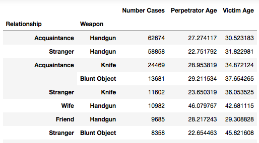
Use a pivot table to tabulate the average victim age, average perpetrator age, and total number of crimes by relationship and weapon over time.
relationships_weapons = pd.pivot_table(known_relationships,index=["Relationship", "Weapon"], values=['Agency Code', 'Perpetrator Age', 'Victim Age'], aggfunc={'Agency Code': lambda x: len(x), 'Perpetrator Age': lambda x: x.mean(),'Victim Age': lambda x: x.mean()})

Sort the pivot table by the number of records.
rw = relationships_weapons.sort_values(by='Agency Code', ascending=False)
#rename
rw.rename(columns={'Agency Code': 'Number Cases'}, inplace=True)
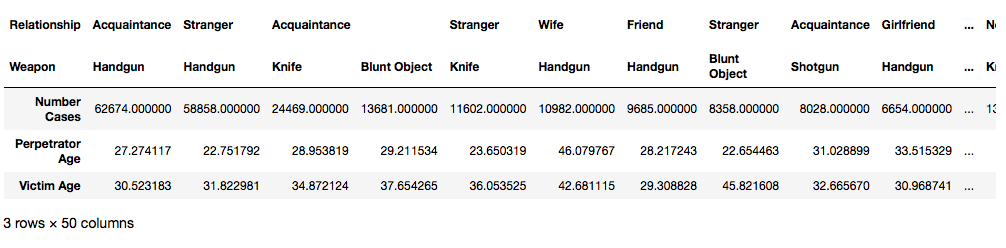
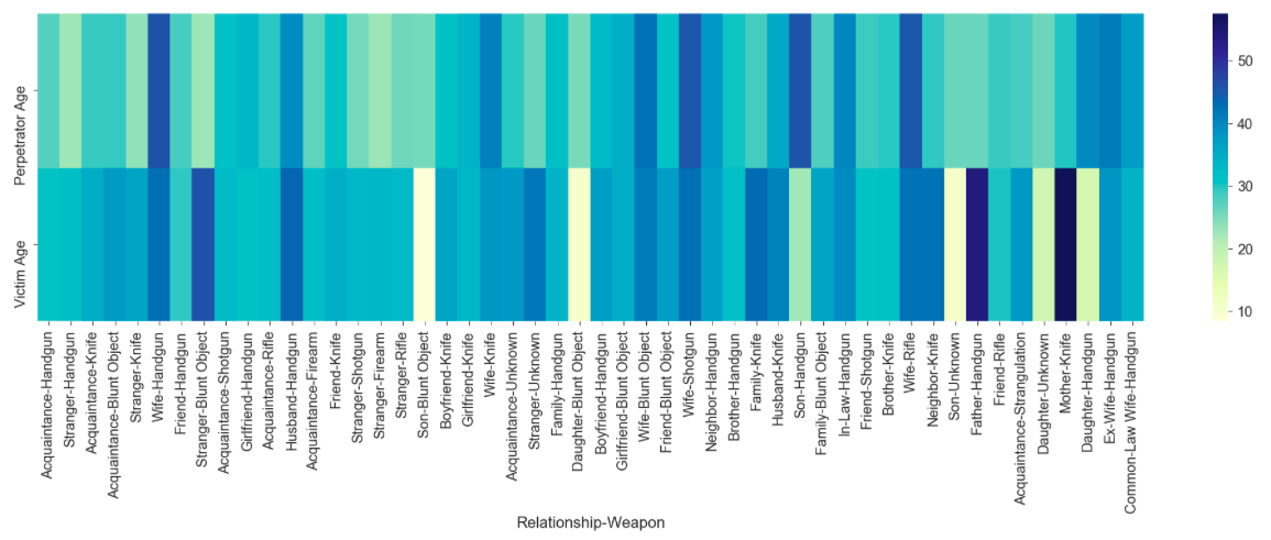
Visualize the ages of victims and perpetrators, for the links that have > 1000 cases
The relationship means the perpetrator's relationship to the victim. Unfortunately, the youngest victims occured as a 'Son-Blunt Object', 'Daughter-Blunt Object', 'Son-Handgun', 'Son-Unknown', 'Daughter-Unknown', 'Daughter-Handgun'. The oldest victims came from a 'Father-Handgun' and 'Mother-Knife' relationship-weapon pair.
It's also interesting because these high-frequency crimes show a younger age profile of perpetrators (more yellows and turqouise) than the victims, except in those above mentioned cases.
rwt = (rw.loc[(rw['Number Cases'] >= 1000)]).transpose()
sns.set_context("notebook", font_scale=2.0)
plt.figure(figsize=(35, 8))
sns_plot = sns.heatmap(data=(rwt.iloc[1:]), cmap="YlGnBu")
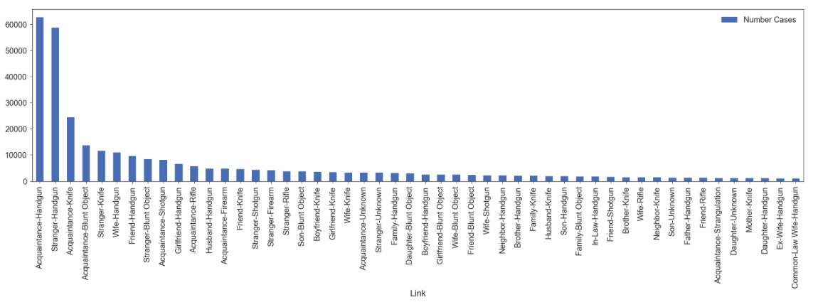
Plot by total cases
cases_1000 = ((rw.loc[(rw['Number Cases'] >= 1000)]).reset_index())
cases_1000['Link'] = cases_1000['Relationship'].astype(str) + '-' + cases_1000['Weapon'].astype(str)
cases_1000.plot(x='Link', y='Number Cases', kind='bar', figsize=(35,8))
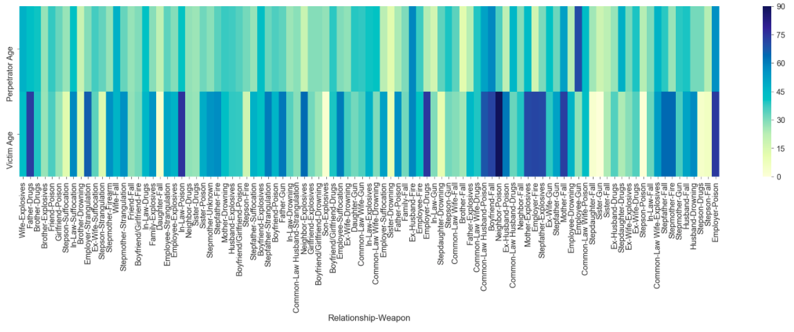
Visualize the ages of victims and perpetrators, for the links that have less than just 10 cases
Here, we're only looking at linkages where there are less than 10 cases per link. For example, Wife-Explosives, less than 10 cases of that murderous combination. And it's interesting to see that where in the high-frequency murders of over 1000 cases, the color profile showed a greater equality of the ages - perp and vic were mostly in the blue-turquoise shades, you can see here that there are more dark blues on average age in the victims - indicating a much older victim demographic than perpetrators in these less frequent murders, using more unique weapons and combinations, like:
sns.set_context("notebook", font_scale=2.0)
plt.figure(figsize=(40, 8))
sns_plot = sns.heatmap(data=(((rw.loc[(rw['Number Cases'] <= 10)]).transpose()).iloc[1:]), cmap="YlGnBu")