Analyzing U.S. Veterans Incomes

Using data from the American Community Survey, I analyzed the disparity of male over female veteran and non-veteran median income. Which states have the greatest disparity in income between the sexes? This post begins merely the exploration journey.
The dataset: B21004: MEDIAN INCOME IN THE PAST 12 MONTHS (IN 2015 INFLATION-ADJUSTED DOLLARS) BY VETERAN STATUS BY SEX FOR THE CIVILIAN POPULATION 18 YEARS AND OVER WITH INCOME - Universe: Civilian population 18 years and over with income in the past 12 months, 2015 ACS 5-year estimates
This post will discuss the non-glamorous task of cleaning this Excel file, creating some metrics to calculate percentage difference, plot, and then use the Folium package to create some static chloropleth maps!
Step 1: Cleaning
#Note: I did some light formatting in Excel prior to
reading in
xls1 = pd.ExcelFile('.../ACS_15_5YR_B21004.xls')

#important to set thousands= ',' to remove the commas
df1 = xls1.parse('Data', thousands=',')
#clean up: drop any column that says "unnamed", just want
state income only
cols = [c for c in df1.columns if c.lower()[2:8] != 'named:']
df1=df1[cols]
print(df1.head())
df1.reset_index(inplace=True)

#drop the first row that has redundant labels, 'estimate'
df1.drop(df1.index[[0]], inplace=True)

#rename index
new_index = ['total', 'vets', 'male_vets', 'fem_vets', 'nonvets', 'male_nonvets', 'fem_nonvets']

#needed to do a workaround to rename the old index that had duplicative
#index names 'Male:', so I created a new index placeholder, removed the
#old one, and set the index to the new one

df1['new_index'] = new_index
df1.drop(df1.index[[0]])
df1.rename(index=str, columns={"index":"old_index"}, inplace=True)
df1.drop('old_index', axis=1, inplace=True)
df1.set_index('new_index', inplace=True)

#convert to floats
df1 = df1.astype(dtype=float, copy=True, raise_on_error=True)
#transpose
df2 = df1.transpose()
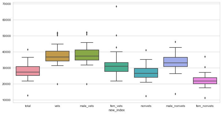
Step 2: Plot for Trends
#clearly see that vets get paid more than nonvets
#female vets and female non vets get paid less overall
sns.set_context("notebook", font_scale=1.0)
plt.figure(figsize=(12, 6))
sns.boxplot(df2)
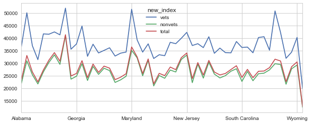
#also we see that vets get paid more by median income than nonvets and the total population
df2[['vets', 'nonvets', 'total']].plot()
Step 3: By How Much?
At this point we should calculate some metrics to figure out the percentage increase of how much:
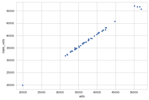
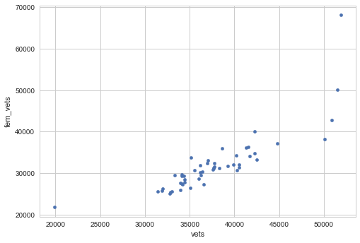
Through some basic scatterplots on the earlier dataset, we know that there is a more correlated relationship between males and vets, and males to nonvets, than their female counterparts:
We can calculate these metrics at the state-level:
#calculate 3 metrics

#percentage increase of vets over nonvets median
df2['vet2nonvet_inc'] = ((df2['vets'] - df2['nonvets']) /
df2['nonvets'])*100

#percentage increase of median pay male vets over female vets
df2['mtf_vetinc'] = ((df2['male_vets'] - df2['fem_vets']) / df2['fem_vets'])*100

#percentage increase of median nonvet male over nonvet female
df2['mtf_nonvet_inc'] = ((df2['male_nonvets'] -
df2['fem_nonvets']) / df2['fem_nonvets'])*100
Step 4: Which states are above the mean?
Here we want to find the U.S. states where our 3 calculated metrics measuring percentage increase, are greater than their respective means using np.where()
print(df2.mean())
df2['top'] = np.where(((df2['vet2nonvet_inc'] >=
df2['vet2nonvet_inc'].mean()) & (df2['mtf_vetinc'] >=df2['mtf_vetinc'].mean()) & (df2['mtf_nonvet_inc'] >=df2['mtf_nonvet_inc'].mean())), 'yes','no')

#plot these states
top = df2.loc[(df2['top'] == 'yes')]
top.set_index('Name', inplace=True)
top[['total', 'vets', 'nonvets']].plot()
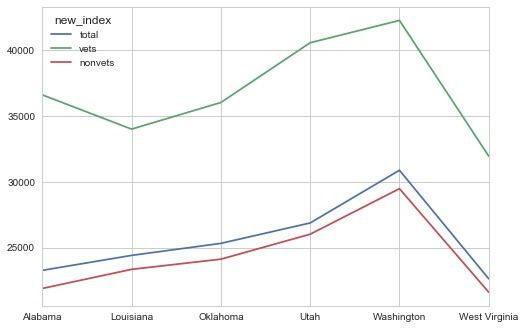
We see that the percentage disparity of how much veterans get paid more than non-vets, male veterans over female veterans, and male non vets over female vets, is greatest in these six states.
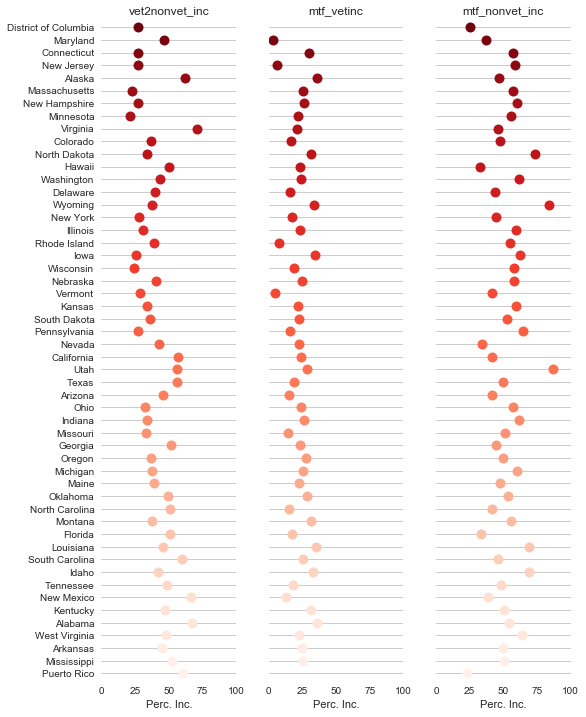
Step 5: Explore all 3 metrics by all states
Here, we use seaborn to create a dot plot of all the three metrics for all 51 states.
sns.set(style="whitegrid")
# Make the PairGrid
g = sns.PairGrid(df2.sort_values("total", ascending=False),
             x_vars=df2.columns[-3:], y_vars=["Name"],
             size=10, aspect=.25)

# Draw a dot plot using the stripplot function
g.map(sns.stripplot, size=10, orient="h",
  palette="Reds_r", edgecolor="gray")

# Use the same x axis limits on all columns and add better labels
g.set(xlim=(0, 100), xlabel="Perc. Inc.", ylabel="")

# Use semantically meaningful titles for the columns
titles = ["vet2nonvet_inc", "mtf_vetinc", "mtf_nonvet_inc"]

for ax, title in zip(g.axes.flat, titles):

  # Set a different title for each axes
  ax.set(title=title)

  # Make the grid horizontal instead of vertical
  ax.xaxis.grid(False)
  ax.yaxis.grid(True)

sns.despine(left=True, bottom=True)
Step 6: Use Folium for U.S. Static Chloropleth Map
I decided to try out a Python package called Folium to create some static chloropleth maps. First, you need to download FIPS code data to create a merged file with proper USPS state abbreviations.
#use test to make the first chloropleth
#prepare two data sets
#read in FIPS file and merge
fips = pd.read_csv("...fipscodes.csv")
df2.reset_index(inplace=True)
df2.rename(index=str, columns={"index":"Name"}, inplace=True)

#merge with df2 to get the state abbreviations
df3 = pd.merge(df2,fips, on="Name", how='left')
df3.rename(index=str, columns={"USPS_State":"State"}, inplace=True)

#make three datasets for maps I want to create
mapdata1 = df3[['State', 'vet2nonvet_inc']].copy()
mapdata2 = df3[['State', 'mtf_vetinc']].copy()
mapdata3 = df3[['State', 'mtf_nonvet_inc']].copy()

#export each to csv
mapdata1.to_csv(".../mapdata1.csv")
mapdata2.to_csv("...mapdata2.csv")
mapdata3.to_csv("...mapdata3.csv")
Step 7: Create 3 Maps
Now, we map the 3 metrics we calculated earlier that show the percentage difference (increase) between the sexes and for veterans and non-veterans. The purpose here is to show measures of disparity. It was also pretty interesting to see that our nation's veterans have a greater median income than the non-veterans.
#You need to download the us-states.json file from
#here: https://github.com/python-
visualization/folium/tree/master/examples/data
state_geo = r'.../us-states.json'
state_mapdata1 = r'.../mapdata1.csv'
state_data = pd.read_csv(state_mapdata1)

#Let Folium determine the scale
map_1 = folium.Map(location=[48, -102], zoom_start=3)
map_1.choropleth(geo_path=state_geo, data=state_data,
         columns=['State', 'vet2nonvet_inc'],
         key_on='feature.id',
         fill_color='YlGn', fill_opacity=0.7,
line_opacity=0.2,
         legend_name='vet2nonvet_inc (%)')
 map_1.save('us_states_vet2nonvet.html')
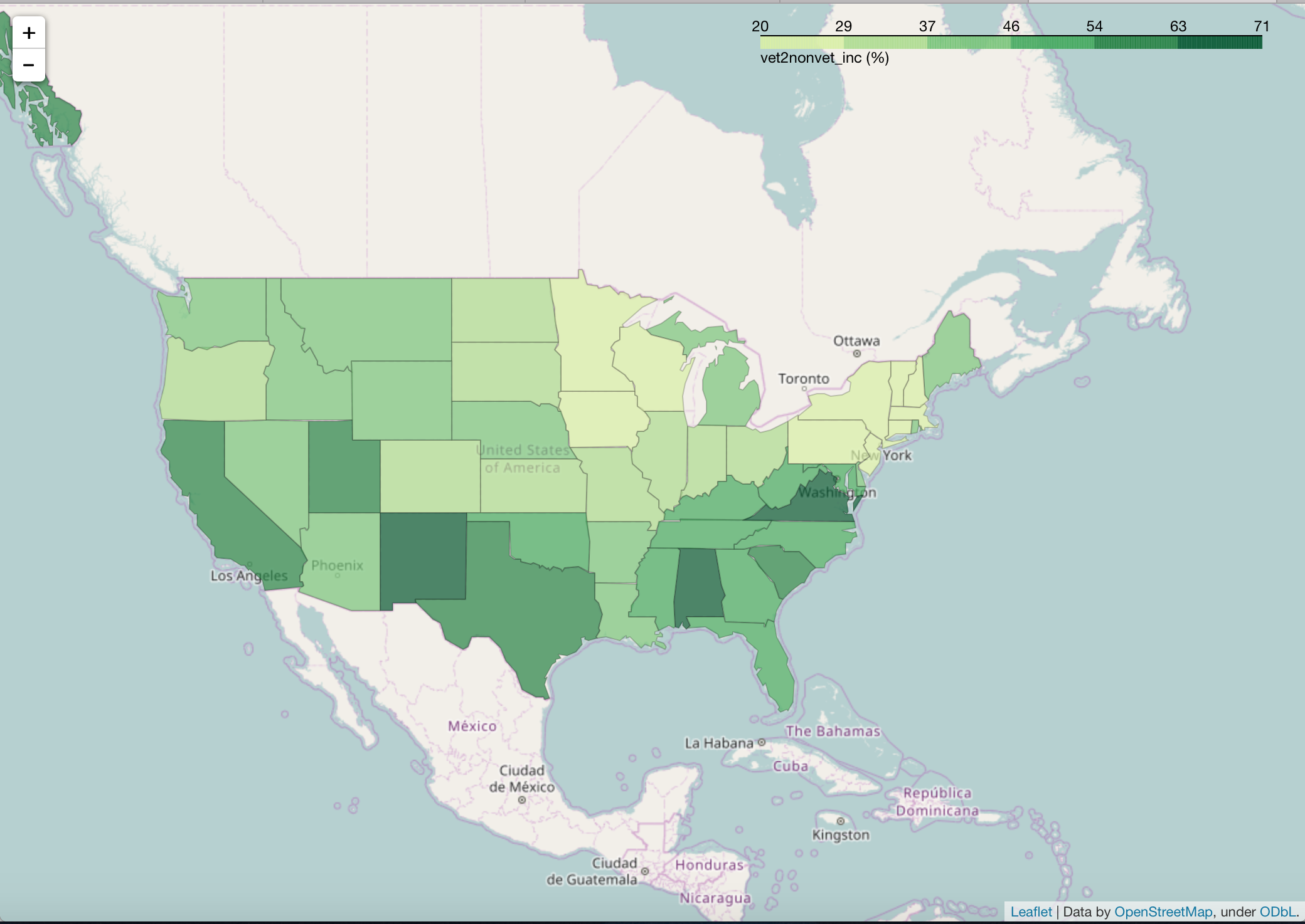
We can see that in New Mexico, Alabama, and Virginia, our U.S. veterans get paid more than non-veterans.
#map 2
state_mapdata2 = r'.../mapdata2.csv'
state_data2 = pd.read_csv(state_mapdata2)

#Let Folium determine the scale
map_2 = folium.Map(location=[48, -102], zoom_start=3)
map_2.choropleth(geo_path=state_geo, data=state_data2,
         columns=['State', 'mtf_vetinc'],
         key_on='feature.id',
         fill_color='PuBuGn', fill_opacity=0.7, line_opacity=0.2,
         legend_name='mtf_vetinc (%)')
map_2.save('us_states_mtf_vets.html')
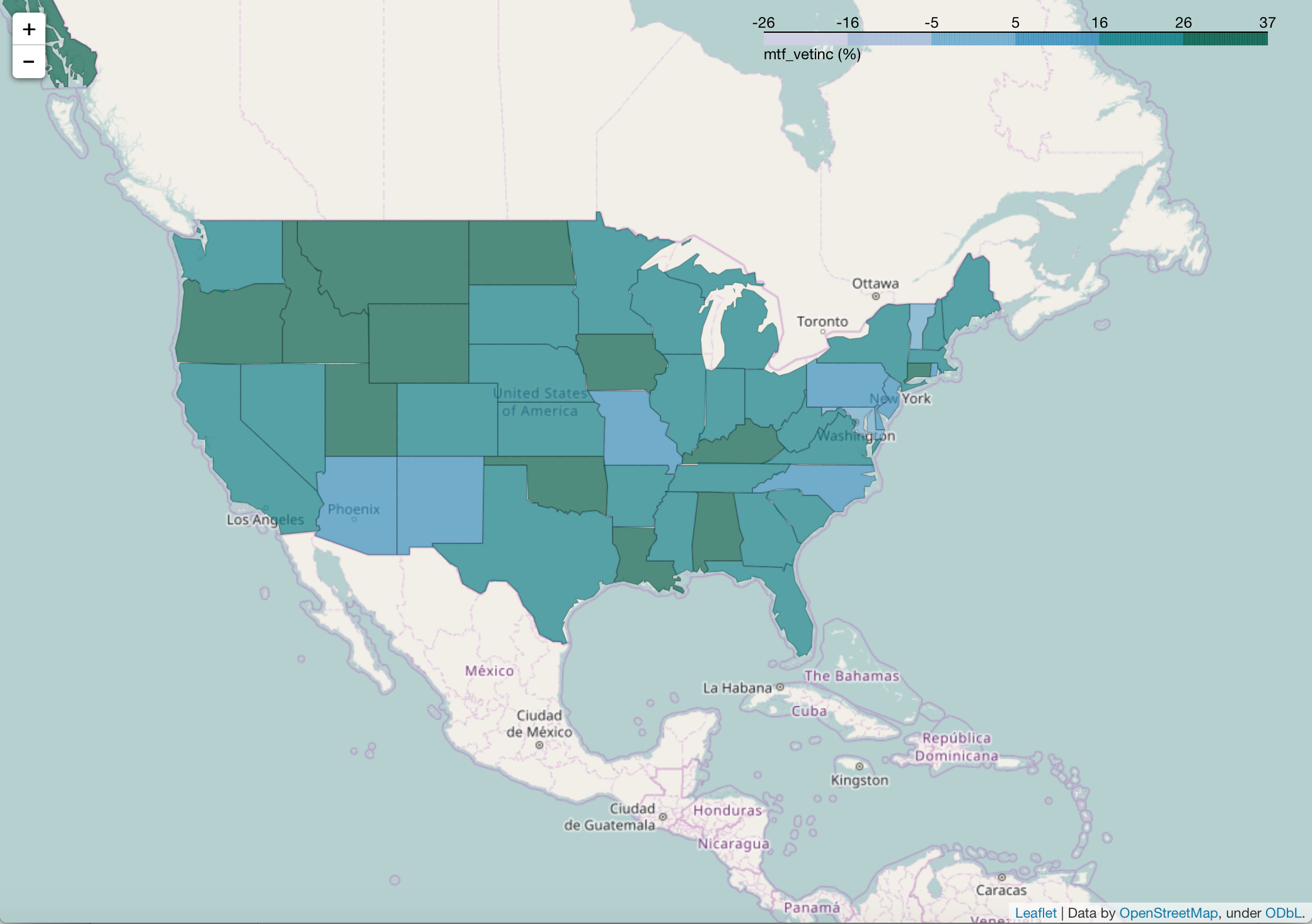
Here we can see that states in the upper mid to northwest like Montana, Utah, Idaho, Wyoming and North Dakota have a greater disparity between Male Veteran median salaries and Female Veteran median salaries.
#map 3
state_mapdata3 = r'.../mapdata3.csv'
state_data3 = pd.read_csv(state_mapdata3)

#Let Folium determine the scale
map_3 = folium.Map(location=[48, -102], zoom_start=3)
map_3.choropleth(geo_path=state_geo, data=state_data3,
         columns=['State', 'mtf_nonvet_inc'],
         key_on='feature.id',
         fill_color='YlOrRd', fill_opacity=0.7, line_opacity=0.2,
         legend_name='vet2nonvet_inc (%)')
map_3.save('us_states_mtf_nonvets.html')
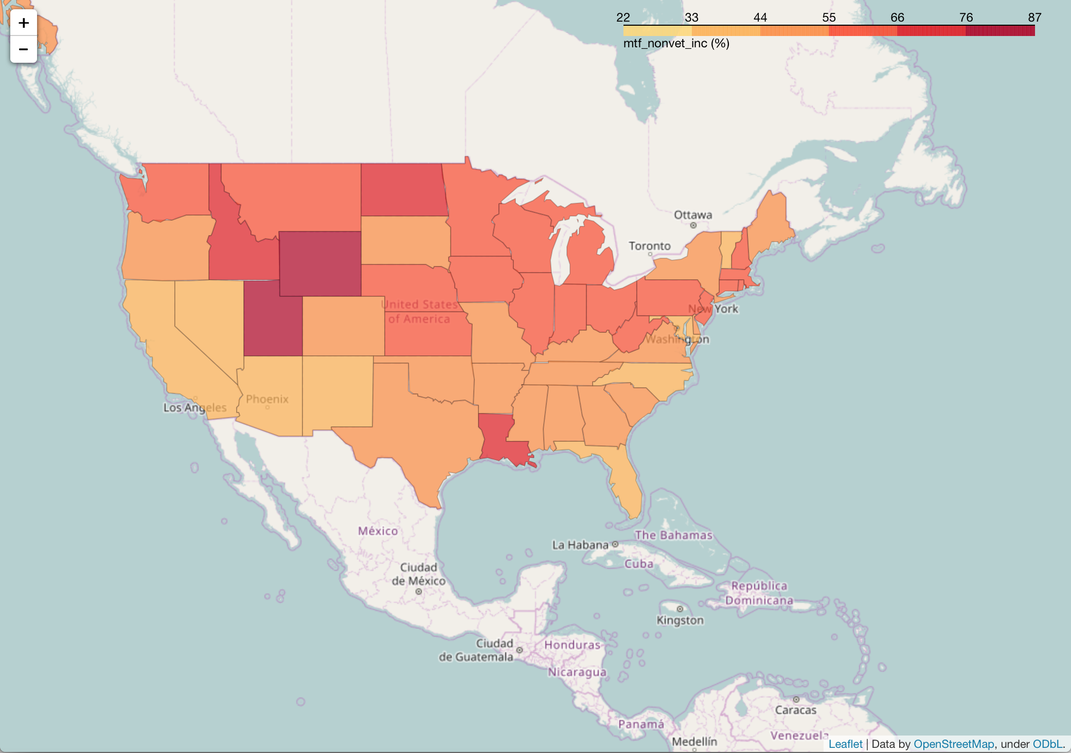
Here, we can see that Wyoming and Utah have a greater gap between the median income of Non-Veteran Male salaries compared to Non-Veteran Female salaries in 2015.
Full script here: https://github.com/nudro/classifiers/blob/master/veterans(003).py