Faker and Feature Importance


I ran into a pretty neat fake name generator that also generates fake addresses in different languages, called Faker: https://pypi.python.org/pypi/Faker. Using Faker, I generated a set of fake data to mock up a scenario of predicting end-of-year employee bonuses for 200 employees based on their workplace behavior survey on 50 questions.
from sklearn import preprocessing
from __future__ import print_function
import pandas as pd
import numpy as np
import matplotlib.pyplot as plt
import pylab as pl
import seaborn as sns
from faker import Factory
from sklearn import metrics
from sklearn.ensemble import ExtraTreesClassifier
from tabulate import tabulate

#Generated Fake Names
fake = Factory.create()
fake.name()

#Print names to a list of 200 fake people
names=[]
for _ in range(0, 200):
   print (fake.name())
   names.append(fake.name())

#Create a fake dataframe of 30 questions with responses from    0 to 3
columns = ['q1', 'q2', 'q3', 'q4', 'q5', 'q6', 'q7', 'q8', 'q9', 'q10','q11', 'q12', 'q13', 'q14', 'q15', 'q16', 'q17', 'q18', 'q19', 'q20', 'q21', 'q22', 'q23', 'q24', 'q25', 'q26', 'q27', 'q28', 'q29', 'q30', 'q31', 'q32', 'q33', 'q34', 'q35', 'q36', 'q37', 'q38', 'q39', 'q40', 'q41', 'q42', 'q43', 'q44', 'q45', 'q46','q47', 'q48', 'q49', 'q50']
df = pd.DataFrame(np.random.uniform(1,5,size=(200, 50)),    columns=columns)
df['names'] = names
df.set_index('names', inplace=True)

#predictor variable, A is bonuses
df2 = pd.DataFrame(np.random.randint(1000,5000,size=(200, 1)), columns=list('A'))
df['Bonus'] = df2['A'].values
print(df.head())
After generating the fake data set of 200 employees, their fake bonuses, and their fake survey question responses, I wanted to use this method exemplified here at Machine Learning Mastery to get the GINI features based on ensembles of decision trees.

First, like in any sklearn exercise, turn your data into arrays. To fit the model, convert to arrays your X (features) and y (target) variables:
#features and target
X =  (df.drop(['Bonus'], axis=1)).values
y = (df['Bonus'].values)

# fit an Extra Trees model to the data
model = ExtraTreesClassifier()
model.fit(X, y)
# display the relative importance of each attribute
print(model.feature_importances_)

#frame of feature names and feature importances
names = ((df.drop(['Bonus'], axis=1)).columns).tolist()
flist = (model.feature_importances_).tolist()
feature_list = pd.DataFrame(
   {'names': names,
     'feature_impt': flist})

#sort most important features in descending order
print(tabulate(feature_list.sort_values(by='feature_impt', ascending=False), headers='keys', tablefmt='psql'))
On a formatting side note, I really like using 'tabulate' which is a pretty-print for dataframes. Just makes it nicer to read. I know programs like GraphLab have this functionality built in: https://pypi.python.org/pypi/tabulate
At this point, it'd be nice to see the values for each of the 50 questions. I use seaborn a lot because who absolutely loves to just use matplotlib??? I modified this Dot Plot into just one stripplot.
fframe = pd.DataFrame(feature_list)

# SNS DotPlot Make the PairGrid
sns.set_context("notebook", font_scale=1.5)
sns.set(style="whitegrid")
g = sns.PairGrid(fframe,
             x_vars=["feature_impt"], y_vars=["names"],
             size=15, aspect=.25)
#changing the size controls the plot's width
# Draw a dot plot using the stripplot function
g.map(sns.stripplot, size=10, orient="h",
  palette="Reds_r", edgecolor="gray")
sns.despine(left=True, bottom=True)
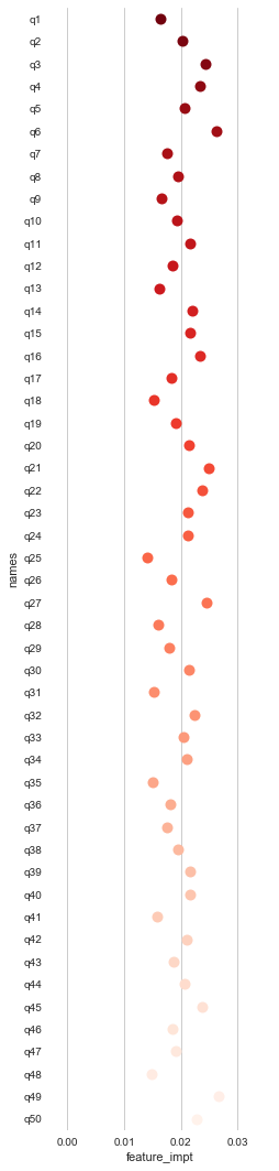
At this point, it looks like Questions 6, 27, and 49 have the greatest feature importance for our target variable, bonuses.
This scenario comes from a real business problem I was working on, in terms of how behaviors in the workplace like burnout, hostility, integrity, innovation, and work/life balance impact high performance.
Complete script here: https://github.com/nudro/classifiers/blob/master/featureimpt_fakedata.py